

Overview
Moodle is one of the most prestigious Learning Management System currently used by over 60% of higher education in the world. The platform allows learners and teachers to communicate easily (feedbacks, discussions, online assessment, ...), structuring and sharing course materials, and also monitoring progress.
The aim of this project was to create better solutions that optimize learning tools and motivation for learning progress.
Timeline
December 2020 - March 2021
Role
UX/UI Designer
Skills
User Journey Mapping, Storyboarding, Information Architecture, Crazy 8s, Wireframing, Visual Design, High-Fidelity Prototyping
Challenge
Poor customization can become a barrier to learning efficiency.
Troubles with navigation cause lack of communication and task management.
Difficulties prioritizing relevant information (assignment, deadlines, ...) due to poor reminder system.
Inconsistency in information hierarchy and visual organization can discourage users from interacting with the course materials.
Goals:
-
Drive learning engagement and intuitive user interface.
-
Propose better content and visual hierarchy so users are more motivated to optimize learning materials.
-
(Personal) Challenge the design decisions and address their solutions.


User Research
I conducted semi-structured user interviews with 5 potential college students who use Moodle and their experiences with the existing features on the web page.
My research encompassed:
-
How users utilize existing features for academic purpose
-
Identifying usability issues that cause frustrations
-
Delivering an intuitive design that optimizes the learning experience

Defining the Problems
After collecting all the interview notes, contextual inquiry and analyzing the gathered data, I was able to categorize the insights into 3 pain points.
Confusing UI discourages users from optimizing their learning progress
-
5/5 participants complained they have missed deadlines unknowingly at least once.
-
Participant 4 expressed that the navigation bar is confusing and distracting.
Action: Relocate the Navigation bar with selected sections to the left panel
Lack of customization/
personalization
-
4/5 participants showed their frustration about the filter for tracking progress and addressed that it should target the assignments individually
Action: Filter the Course page by materials instead of having a dropdown menu on the nav bar
The current reminder system is not efficient
-
5/5 participants expressed that users should have reminder notifications for their assignments/deadlines/course works.
Action: Add customized planner to the Calendar page
Conceptualization
After creating the information architecture and using the Feature Prioritization Matrix to validate user values and time efficiency, I came up with some quick paper sketches.


Digitalize the Designs
After creating low-fi concepts for primary use cases and consulting with the Stakeholders on the mockups, I began to conduct usability tests with the low-fidelity mockups.
After several iterations and usability consistency, I began digitalizing the designs.


Solution
The design solution makes it easier for users to navigate materials and customize daily planning.
The final deliverable for the project includes 3 hi-fi screens, master components, style guide and interactive prototype.
Test the prototype: Click Here


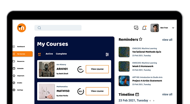
Coordinate Tasks Better
Left navigation panel with fixed elements helps users identify information with confidence and optimize their task performance. Also, the Important section helps remind users of important tasks.
.png)
Scan Content
Quartering course content into helps users navigate through information better and bring clarity to their learning progress. Also, the mini calendar helps generalize the progress without making users scroll through piles of information.
.png)
Customize Personal Schedules
With the "Add" button and dropdown menu, users can easily filter and customize content and prioritize information.
Validation Testing
To validate my design, I conducted an Unmoderated Usability Tests with 5 people on my prototype. The interactions were screen recorded and the users were able to speak about the features and flows.
Successes:
😄 5/5 users were able to use the left navigation panel to navigate from different pages.
😄 4/5 users interact with the dropdown menu from the Schedule screen.
😄 User 2 and User 3 interacted with the mini calendar located on the Course and Schedule page.
Pain Points:
🙁 5/5 users failed to interact with the Important section.
🙁 5/5 users failed to interact with the breadcrumb on the Course page / User 2 addressed that the text on some section is not big and clear enough
Iterations
Problem 1: Inefficient Text Accessibility
User 2 addressed that the secondary text is not big and clear enough / None of the users interact with the breadcrumb located on the Course page.
Solution: Use WebAIM to assess and improve the text readability in UI elements (WebAIM is a Utah-based non-profit organization that provides web accessibility solutions)
Problem 2: Failed to discover the Important section
Users might not feel compelled to interact with the Important section because the section is not visually discoverable enough.
Solution: Relocate the Important section to the top right of the page and insert icon to increase discoverability

.png)
.png)
Project Learnings
As this is my first UX project, I had based a lot of my design decisions on personal assumptions. I was tempted to create a complex and multi-functional design, but after countless iterations, I learnt that an intuitive design should answer the “why”. As I iterate on my hi-fi design, I learnt that there were countless design gaps that create inefficiency in user navigation and feature prioritization. I learnt that the smallest details make the most impact, which can only be improved through iterations. Throughout the process of designing end-to-end, my only stakeholder and critique are the Udacity instructors. By learning how to collaborate and reaching out for feedbacks as soon as possible, I gained objective perspectives on how I work and build products and how to prevent on-loop mistakes.
